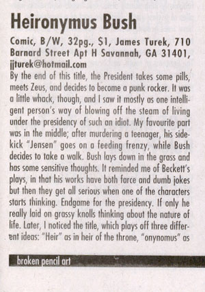
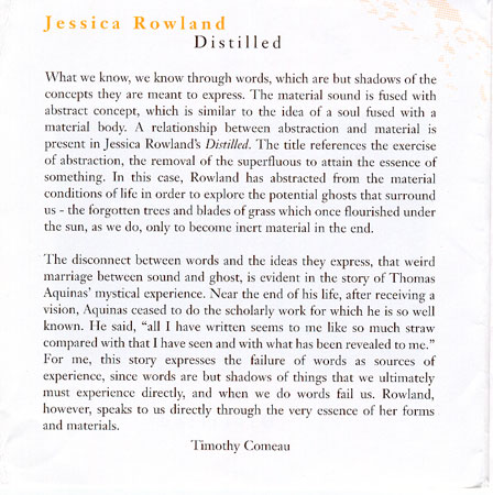
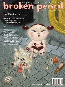
Published
My contribution to the book Decentre: concerning artist-run culture/a propos de centres d’artistes published by YYZ Books, and which launches tonight in Toronto.
———————–
Artist-run centres developed to exhibit what at the time was unmarketable, and in so doing became the elitist arbiters of a contemporary taste, based on a reputation for taking risks and initial support of those who went on to become the academics and international art stars (and therefore the default judges of what constitutes good art). Undoubtedly without their presence we’d be culturally poorer, yet today they have become part of an economic system of which they’re in denial.
Because artists have always depended on the patronage of the rich, the artist-run centres have become essential within the overall art system, arguably the only “dealer” that really matters to patrons. To have any sense of artistic legitimacy in Canada – the type that gets you bought by institutions – one needs to somehow be affiliated with an artist-run centre.
Today’s art institution will buy based on a trendiness they equate with aesthetic and cultural merit, and their purchase perpetuates the artist’s delusion that they matter in some grander context, even while their piece lies in a crate in storage. Had they sold to a private patron, they could at least watch as this person re-sells their work to another rich person or to an institution looking for a piece of trendy action on someone once overlooked. The seller does this to a potentially large profit, a share of which the artist won’t see.
Because artist-run centres are staffed by a relatively small network of professionals, they’ve unfortunately become nests of nepotism. How many young artists new to the system send off packages bi-annually only to watch the exhibition calendar fill up with ”curated” shows featuring artists who are friends with staff and board members? This is exacerbated by allegiances to obsolete ideas and aesthetic ideologies which result in shows of boring work weakly justified with poorly written brochure essays.
The fortunate thing is that every five years an artist-run-centre is populated by a new generation of staff, exhibiting artists, and board members. This makes them highly adaptable to changing cultural conditions, and perpetually reformable.
 Hollywood Inferno | Part of the Images Festival 2003, Toronto
“Loosely based on Dante’s Inferno” as the teaser reads, we find a Virgil who is a scriptwriter and a Dante who is an 18 year old girl named Sandy, “which rhymes with candy”. At Easter in 1300, Dante found himself in a dark wood – 701 years later, Sandy finds herself a bored cashier in a candy store. The ending of this film is not for the weak stomached, as it is rather disturbing, (but then again, so is a web search on Indymedia for pictures from the war). The fact that this dual projection video does make the skin crawl is an achievement in itself, and I was completely enthralled with its postmodernist hall of mirrors. Much of the film’s dialogue is lifted from various sources (dialogue from films such as The Last Temptation of Christ, The Last Tango in Paris, George Lucas in conversation with Bill Moyers, and, my favorite, “various art dealers and collectors” from New York’s art scene) and the credit list serves as an indictment of our flash-and-glam culture, with teenagers who seem victimized by the failed dreams of the adults left to mutter on pretentiously. In the end, our culture is a hell as real as that which Dante depicted 700 years ago.
Videograms of a Revolution | Part of the Images Festival 2003, Toronto

Don’t ever take voting for granted, since these people had to take over their TV station to get that right. The North American self-absorption (which is even reflected in the fact that most people don’t consider Mexico a part of NA) means that many will never see this great compilation by Harun Farocki. The Romanian Revolution of December 1989 was a TV revolution – the people established their base in the TV station, took over the airwaves, and broadcast their proclamations and revolutionary announcements. While watching it I could almost imagine that the year was 2189, and that I was in some History class – since once something’s on video, framed by the edges of the monitor, it is as visually timeless as any painting that has been gathering dust for a few hundred years. As fascinated as I am with the French Revolution of 1789, which also resulted in the execution of a king, I was also fascinated to see a similar uprising and the applause of ordinary people as images of the dead Ceaucescus was broadcast on the evening news. “Imagine, all these years we were afraid of an idiot,” a woman says as she drives in her car, surrounded by people galvanized in the streets. That line and the film in general are a reminder that we quite often chose our misery through lack of political conviction and action.
Tamala 2010 | Part of the Images Festival 2003, Toronto
As the opening night film, this received much Images Festival hype. What was really intriguing about this movie was how it was an analogy for Japan’s postwar economy as manifested through the Hello Kitty product line. The majority opinion towards it was lukewarm. I can see why, since it was rather wacky – but having recently begun to wonder what films might look like in a 100 years (example: Matrix Reloaded vs. The Great Train Robbery) I found the wackiness of this film illuminating. It should be said that its exotica is not so much the result of 22nd Century foresight on the part of the production team, but rather is because it is a film from Japan, and is thoroughly Japanese. As anime, it deals with their aesthetic obsession with cuteness, and successfully uses computer graphics rendering to enhance the visuals. The highlight of the movie was a scene depicting a mediaeval almost Bosch-like painting of slaughtered cats.
Unbalancing Act by Jo Cook | Site 19, C-21 Quadrant, Mayne Island BC, VON 2J0 10$ | zine

This is an elegant little book, printed on heavy paper in colour, with a nice juxtaposition of printed text (computer) and handwriting (human touch). I appreciate the fact that the narrative is oblique as much as I appreciate its physicality. The title could refer to a psychological condition, the unbalancing that occurs through trauma. The narrative and loose drawing only hint at this however, and wide latitude is given to the viewer to imagine their own interpretations.
Afield by Florentine Perro |f_perro@hotmail.com | Site 19, C-21 Quadrant, Mayne Island BC, VON 2JO 10$

Produced with cardstock and color copying, the strength of this zine is in its craftsmanship. It tells an abstract story, the plot of which “could be summarized as the search (eventually succesful) for someone who is having trouble making a fluid appear”. This peice of text is juxatposed with a statement regarding the orgasms of molluscs; that, and a recuring theme of ducks, makes one think that this is an exploration of the emotional life of beings, beyond the usual mamalian limits we put on our ideas. If it walks and talks like a duck, chances are it’s a duck the old saying goes. Combined with Decartes’ “I think therefore I am”, this booklet would suggest that ducks are ducks because they are.

To the editor:
I simply to express my support for the Kyoto Accord, and hope Pickering-Ajax-Uxbridge MPP Dan McTeague will vote in favour of it when it comes up later this year.
I am a young person, 27 years old, who is very concerned about the world I am in the process of inheriting. While I understand Kyoto will have economic consequences, I believe scaremongering on this basis is both irresponsible and representative of a parochial view. It would seem to me that those so heavily invested in a fossil fuel-based economy are refusing to see the economic benefits (and I would think, great opportunities) of a Green-based on.
The jobs that will be lost are — like an ‘executioner’ — jobs that probably shouldn’t exist in the first place, since they are detrimental to the long-term survival of the biosphere.
Members of parliament are from a generation older than mine. They have experienced and enjoyed an ecosystem that will probably not exist for my children or grandchildren. This is something new for us a human beings and as citizens or Canada; the rural generations of a century ago did not imagine their descendants not enjoying clean rivers and clean air.
Why should we make the future pay for our selfishness?
Kyoto may be considered a small and almost insignificant step, but we have to start somewhere.
Please vote in favour of Kyoto.
Timothy Comeau, Ajax
untitled zine, James Whitman 536 E20th Ave Vancouver BC V5V 1M8 jameswhitman@hotmail.com

There’s not much to say beyond the fact that I really liked this zine. One: I appreciated the use of cardstock rather than paper, to give the book a secure feeling in the hands. Second: I liked the drawings, simple squiggly abstract line drawings in elegant black and white; no text and no title allows one to make what one wants to out of them. In my case, they reminded me of the work of the design firm M/M from Paris, whose work I am currently interested in (check out the album packaging of Bjork’s “Vespertine”). Summary: staple bound cardstock booklets printed with black and white squiggly drawings are hot. (Timothy Comeau)

Passenger & Tour Guides Exhibition catalogue, Kevin Rodgers, Derek Sullivan, published by ArtSpeak Gallery, Vancouver.
As the intro says best, “Rodgers and Sullivan explore the construct if the West Coast as it is seen from the outside, with its attendant romanticization and associations with the ‘frontier'”. The package overtook the content, consisting of a beautiful card envelope printed with wild flowers which opens up to photographs of the exhibition of the same name. Other standard tourist images are printed on the envelope sleeves, in such a way that they could be used as postcards if one so wished. The envelope contains sheets of folded paper; most are cream, one is white. The cream sheets, evocative of elegant stationary, contains random handwritten fragments from something like a journal or personal letters. The white sheet unfolds to gorgeous hand drawn map of an imaginary coastal city. This one gets a grade of Z because A+ seems low. (Timothy Comeau)
Losercore Issue 1 and Older Man Younger Woman zines, 2$ each. c/o Pleasure Point RR 2 Barry’s Bay ON KOJ 1BO weetzie@webhart.net

There seems to be a need in our narrative culture to tell our stories no matter how banal; Maureen MacMillian has shown her ID card at the gate of humanity with these humble publications: unlucky in love alternated by luck with love. The first, “Losercore”, tells the story of self-pity (“being the girl you leave behind when someone better comes along (usually better means bigger boobs, better figure, longer hair)… “) and regrets (…”regret # 43 I never told you how I felt and now you’re gone…”and 44 “…you were the coolest most magical soul and when I had you I let you go…”). A crueler reviewer would say that this is all cliché crap, but that would show a lack of respect for the universal experiences that allow such things as love and regret to exist in the first place. I’m sympathetic to this type of expression, whereas the other need we have to proclaim love from the rooftops I find more alienating. One gal’s prince charming is another’s sleaze; in “Older Man Younger Woman,” she’s found love with someone who’s thirty years older and has an ex-wife. He sounds great, she sounds happy, but the strength’s of this zine isn’t the exposition of her subjectivity, but rather it’s pleasant design, using standard 1950s nuclear family imagery with typewriter font and headlines done up in ransom-note-cutup style. Nothing groundbreaking here, this stuff feels like the literary equivalent of a chocolate chip cookie – sweet trivia. (Timothy Comeau)
 small dead woman Exhibition catalogue, Kevin Yates, Diana George and Charles Maude, published by ArtSpeak Gallery, Vancouver
I recently saw Kevin Yates’ “small dead woman” at Toronto’s YYZ gallery, where its art world charm seemed rather forced, since in essence it just looks like some child’s forgotten doll. This catalogue is part of Artspeak’s series of matching up a text with a piece that has been exhibited in the gallery – in this case the accompanying text is by Diana George and Charles Maude, and entitled “Last Seen”. It expounds upon the unfortunate habit prostitutes have of getting murdered, and their bodies being found in public wilderness. The attempt is made to create meaning in this arc of being “last seen” in urbia and “found” in nature, ignoring the rather obvious fact that brush is good for hiding large things like bodies. I for one don’t believe there is a need to generate metaphorical significance out of the pragmatic practices of psychopaths. This book came in the unusual format of a file folder, which was aesthetically attractive, but makes for an awkward read. Given the binding is one of those slidy bar things I suppose the idea would be that I as the reader could disassemble it. However like all art in galleries which we are invited to touch and decline (due to tradition of not touching anything) I didn’t want to take it apart. Summary: food for thought with poor ergonomics. (Timothy Comeau)
